

A design system is a guide that contains a series of reusable components organized coherently to build a modern and delightful experience. By using a design system, engineering teams have reusable bits of code which enable them to build user interfaces faster.
In this article, We’ll go over how to use a Figma design system as a developer and some basic Figma features.
What is Figma, and how to navigate through it?
Figma is a collaborative design tool used for interface design. With Figma, one can design, prototype, and export specific assets.
When you open a Figma workspace you are presented with an interface having a toolbar and three sections.
The toolbar
The toolbar is found at the top of the Figma interface containing several tool icons that you will need as a developer to either access the design or communicate with the designer. The move, hand, and comment tools are on the left, and the share & play prototype are on the right.
The left section
The left section contains the sidebar that houses the pages of the design file. Designers use a separate page for better organization and separation of different parts of a design system like the colors, typography, icons, file assets, etc.
The middle section
The middle section is a big canvas containing all the projects' designs, where developers can access and view the designs to be coded,
The Right Section
and finally, on the right section, there is another sidebar that contains all information about every element in the file. It houses the comment, inspect, and export panels.
Quick Shortcuts:
Figma has a number of shortcuts available for both Windows & mac users. Let’s quickly cover some of the useful shortcuts a developer should know.
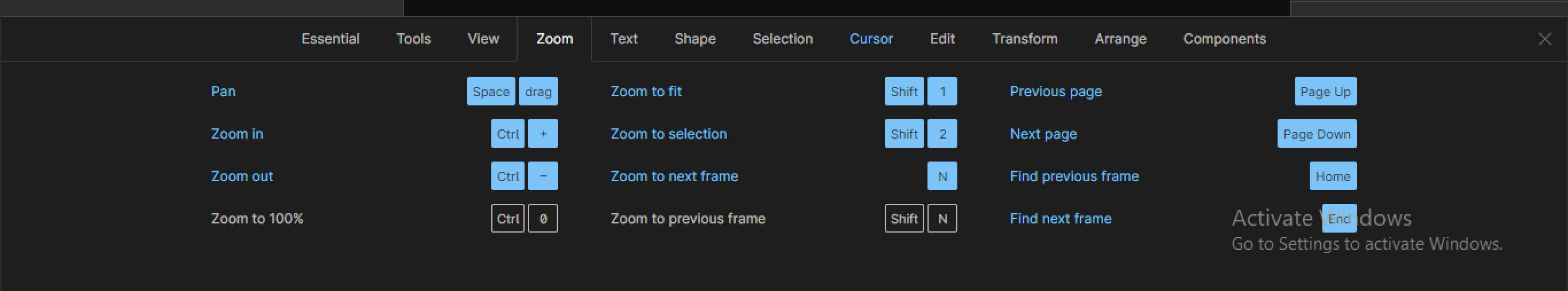
When you open a Figma file, you might see the content zoomed in. To zoom out and see the entire canvas contents, press SHIFT + 1.
Press SHIFT + 2 after selecting a frame to zoom into that frame.
Press + and - keys to zoom in and out of a page.
Note: You can access all Figma shortcuts by pressing ctrl + shift + ?.
Shortcut Interface on Figma
Now that we have gotten a basic introduction to Figma workspace, navigating around Figma and its shortcuts, let us look into how to use a design system as a developer.
A brief explanation of a design system?
A design system is a guide that contains a series of reusable components. It usually contains a set of standards, reusable components, and patterns used to create visual consistency throughout a product design. It will make more sense when we cover over components of a typical design system in the sections below.
Why a frontend/UI developer should implement a design system.
Implementing a design system has a number of benefits. Below are some of them.
- When the development team implements a design system with a code in-line with the Figma design system, development becomes faster because they have all the small bits ready they just need to fix them for newer interfaces.
- Makes it possible to make changes much easier and faster. For example, if you build an input component in code as a developer from a Figma design system and after a while the border color of the input is changed from black to blue, to effect this change you only need to make this change in the input component. It will be reflected on every instance of the input component across the entire product.
- Implementing a design system helps developers not to repeat themselves, e.g once I have a button component I can reuse it and I won’t have to build buttons in multiple places in the project.
Components Of A Typical Design System (with examples)
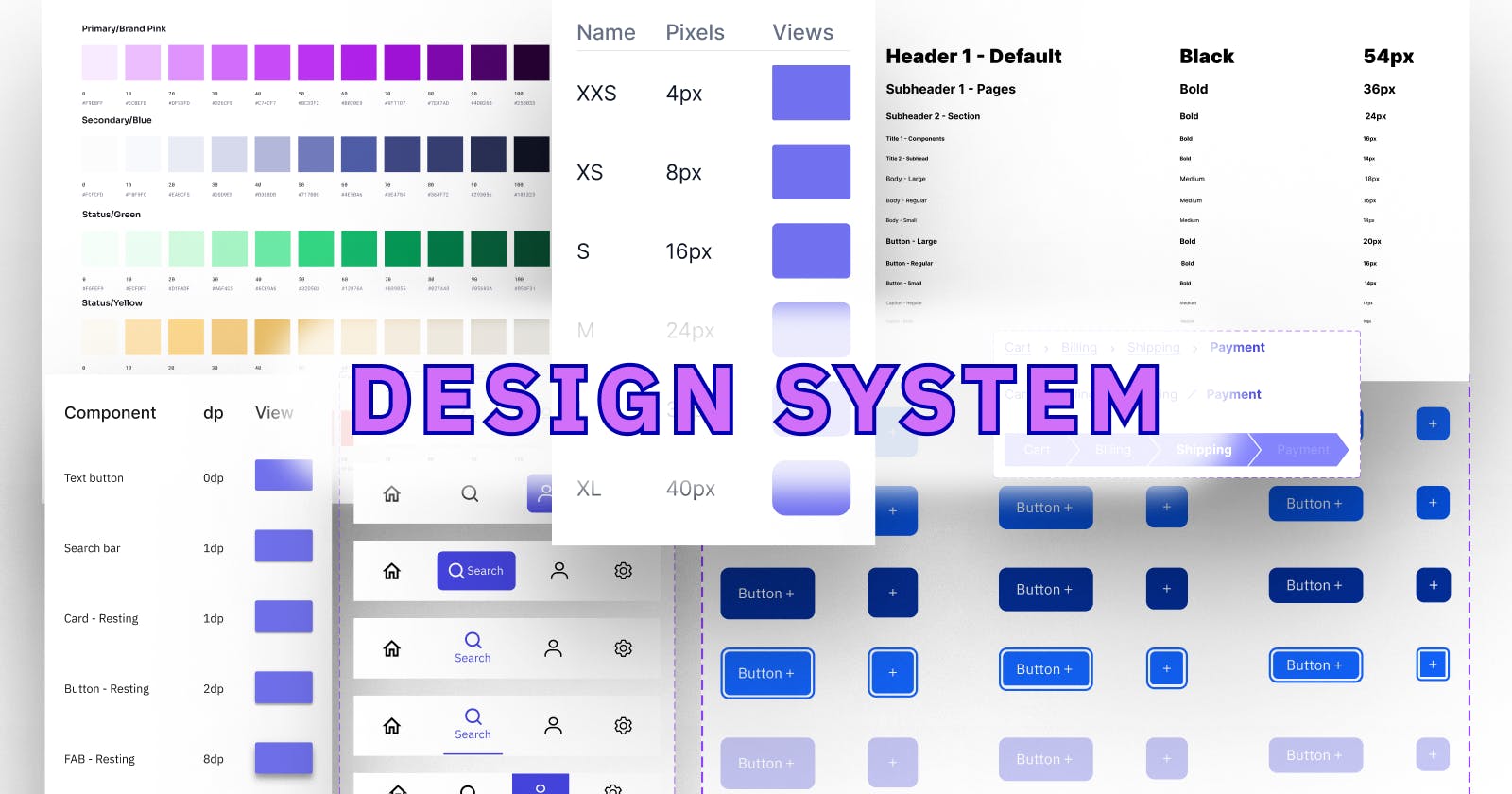
As we learned in the previous section, a design system usually contains reusable bits of designs such as buttons, inputs, etc with the sole objective of reusability and consistency (example below).
Design Tokens/Atoms
These are the smallest units or parts of a design system.
- Typography:
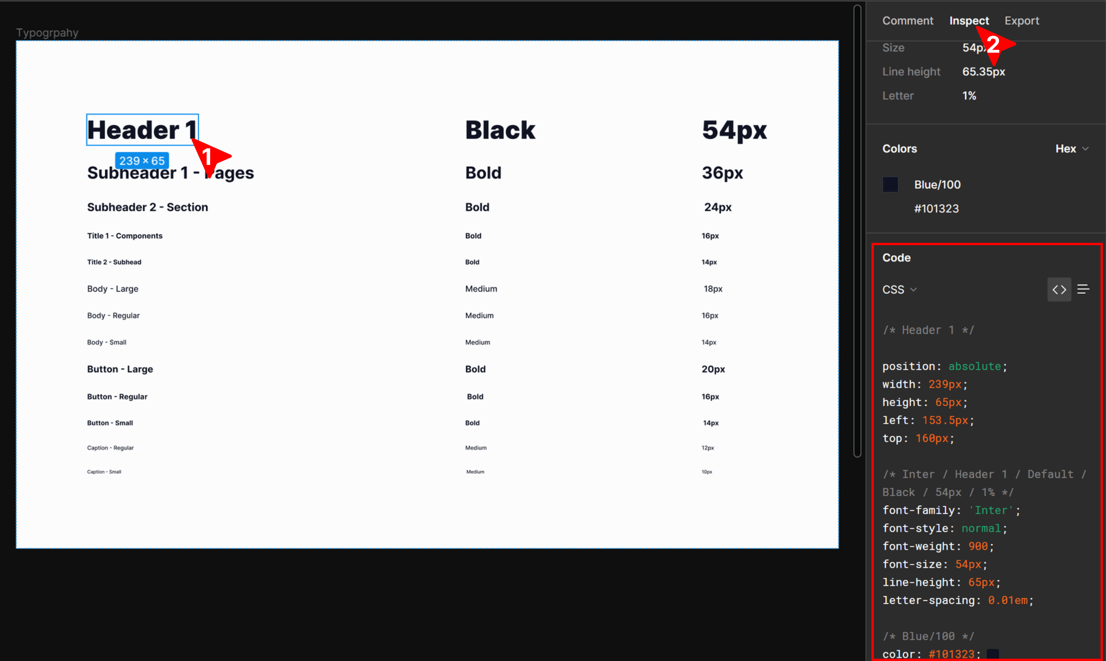
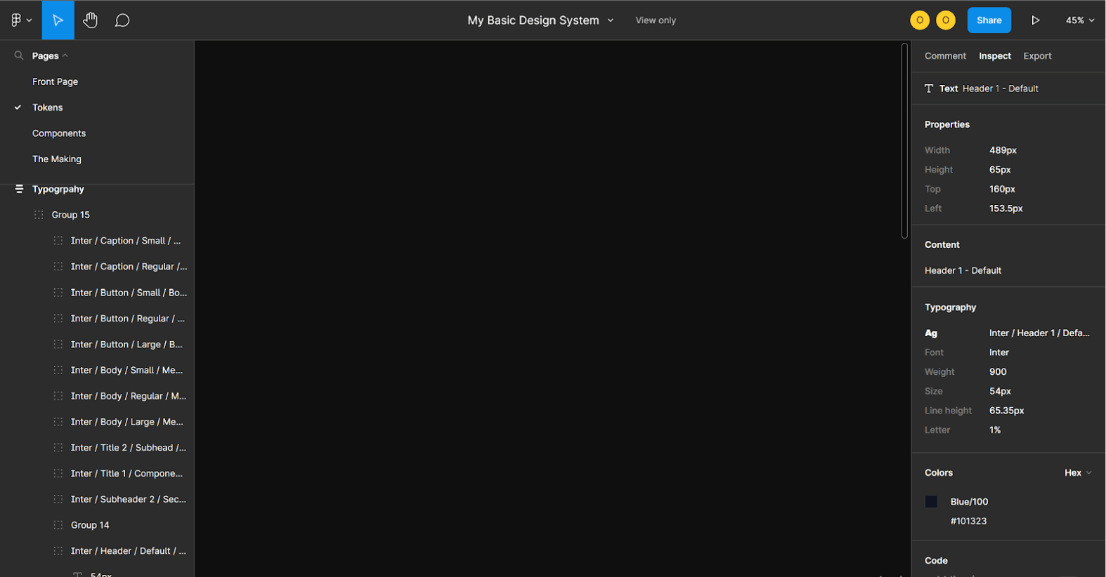
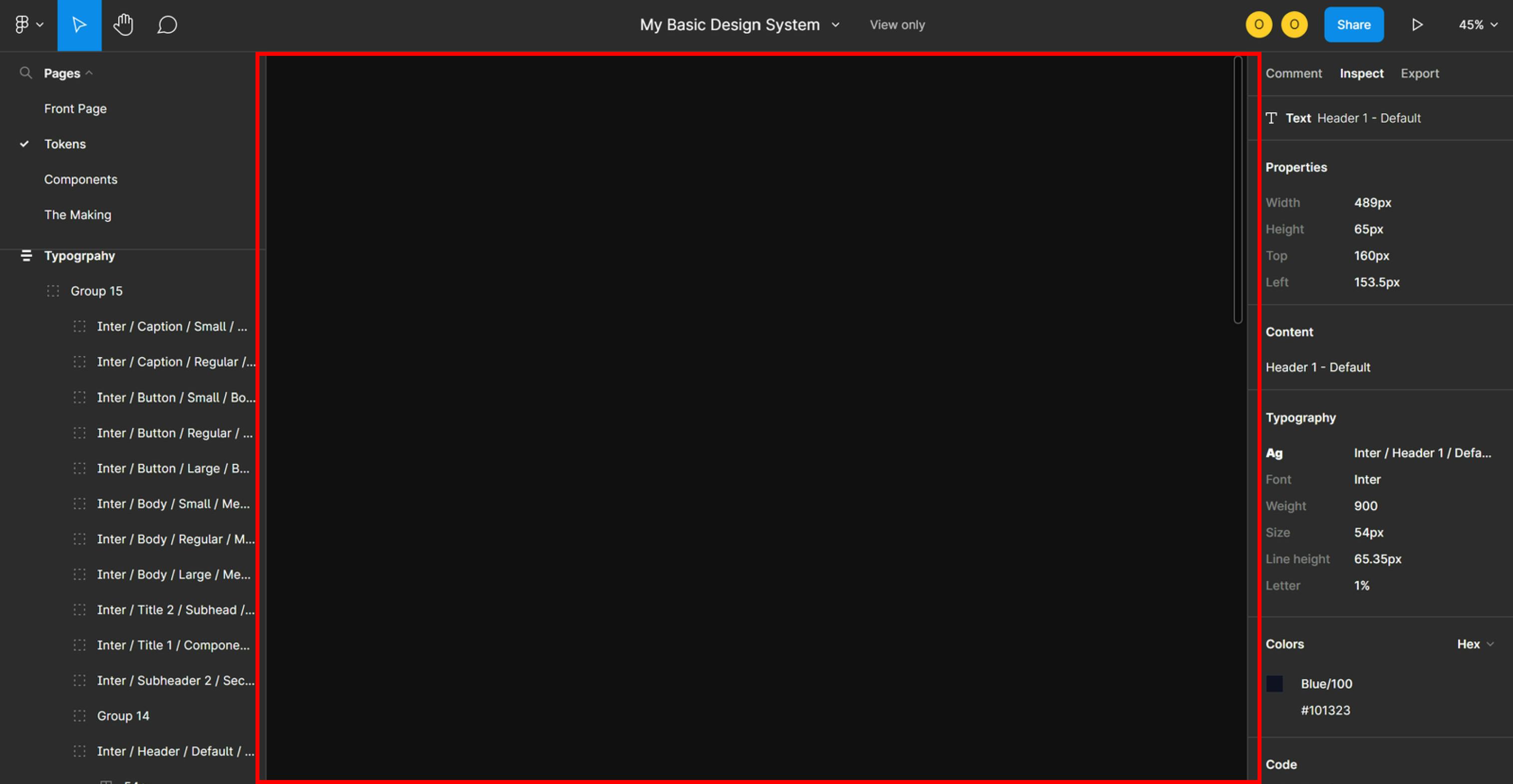
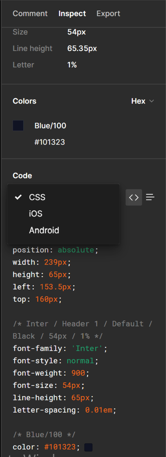
To get the styles of the typography component, simply click on the element, and on the right panel click on inspect tab and you’d see the styles as shown above. By default, the styles shown are CSS styles but you can toggle to see the IOS and Android variants.
The best way to build a component is to build one that can be extended to cover all possible variants in the design system. Alternatively, If you’re a web developer, you can write CSS classes for each variant with the names of the component variants e.g. header1, subheader1, etc. as seen above so when you want to use anyone, you just add the class to the element.
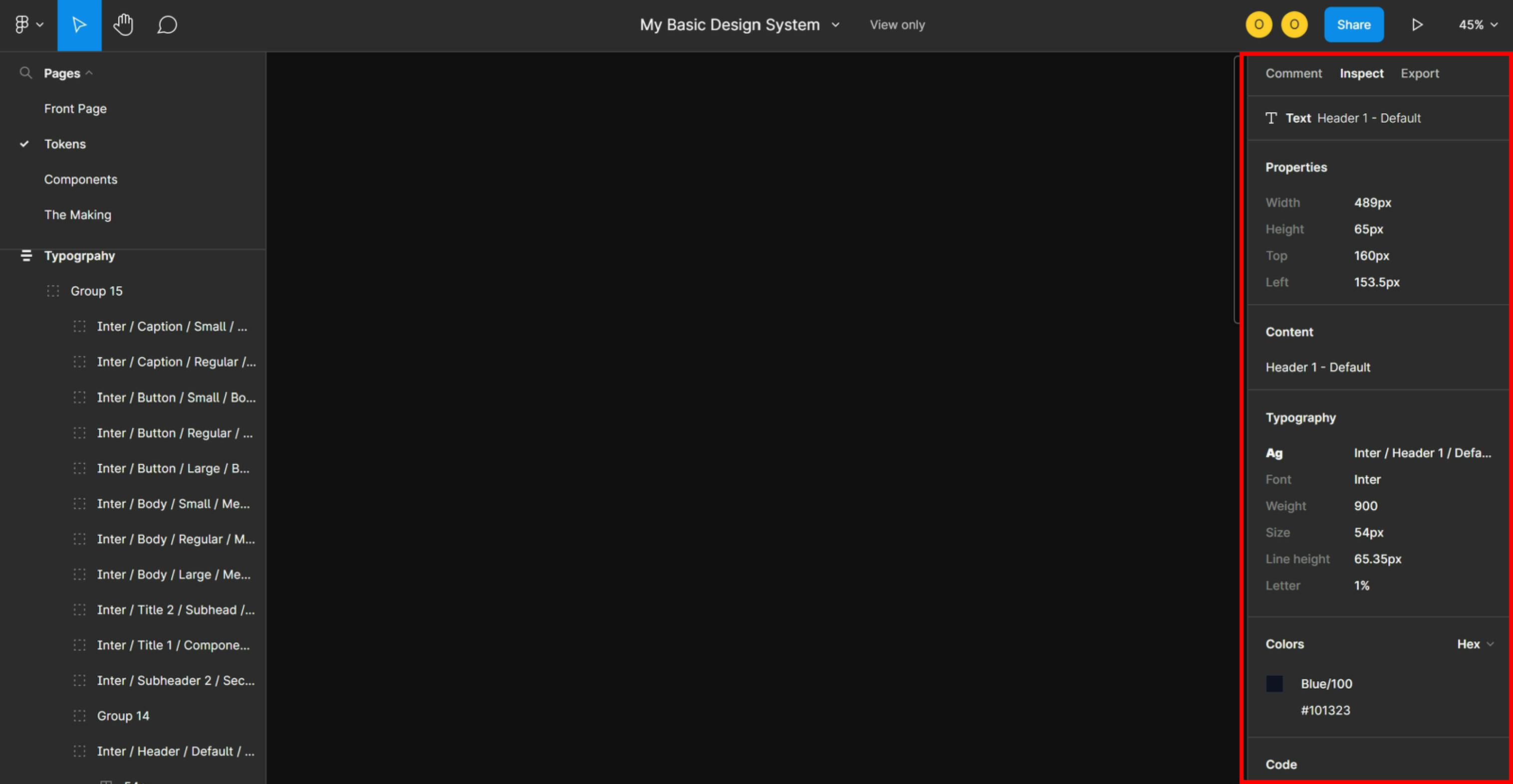
We just learned how to get the style of a typical typography component. Now, let’s say you have implemented this typography component in your code and when building from the main design, you see some text, how can you tell which variant of the typography component was used?
You can tell by clicking on the text and on the right panel under inspect tab, you’ll see the name of the component variant under Typography and this will be the same as the variant name in the design system. See a pictorial representation
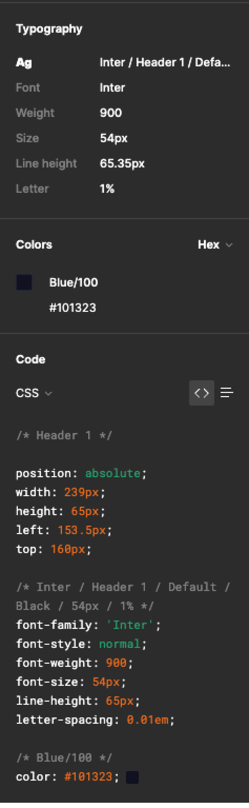
A rule of thumb when building the component in code is to name it and its variants based off the names on Figma so they are easily recognizable.
Colors
It’s good to have all colors used in a design available in code (in CSS for web developers) so that you can build faster also if there’s a need to update any color you can quickly make that change in a single place.
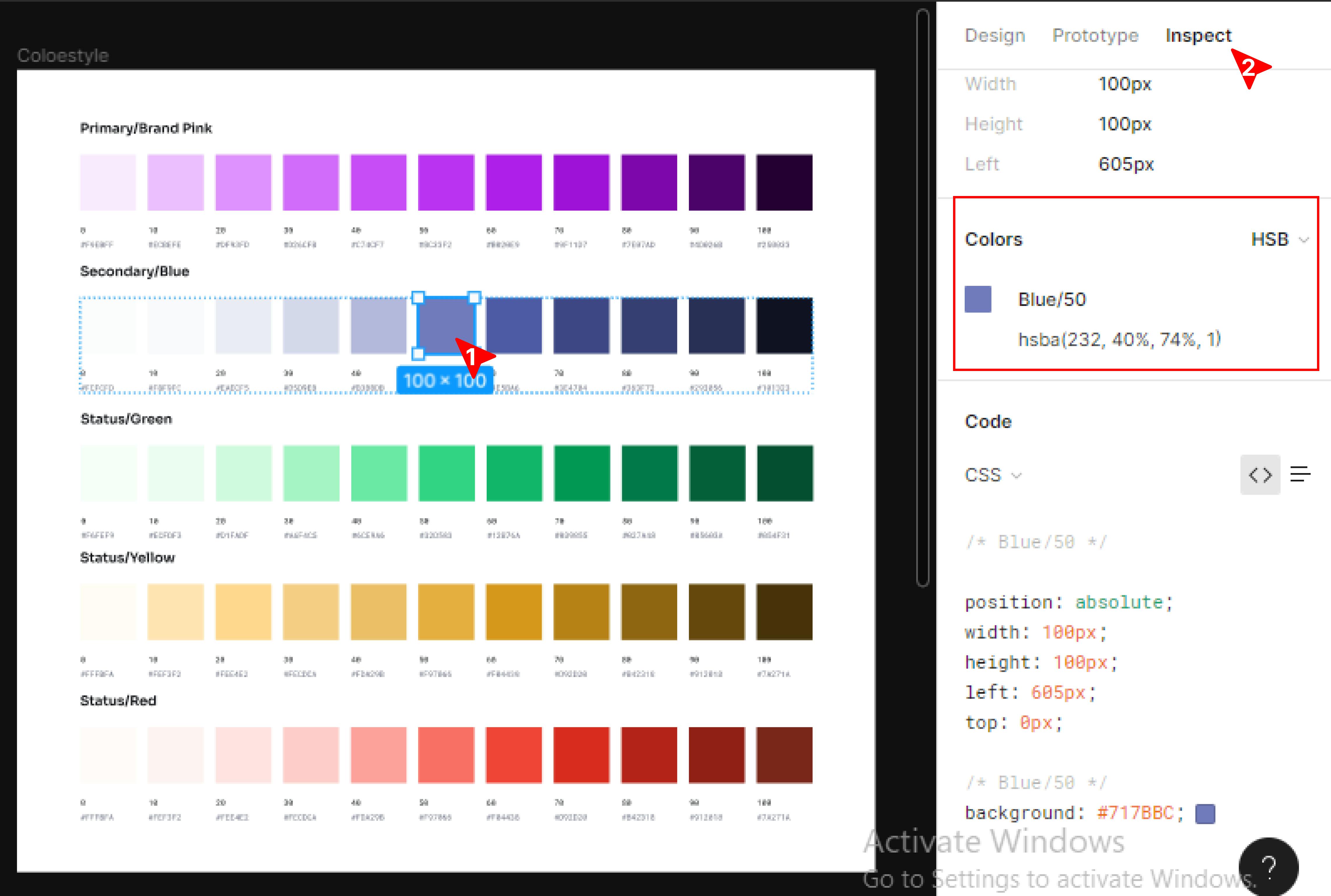
For you to know the properties of a color style created, once you click on the color you can easily view its property from the inspect panel and copy them from Figma into your code at any time.
Border radius
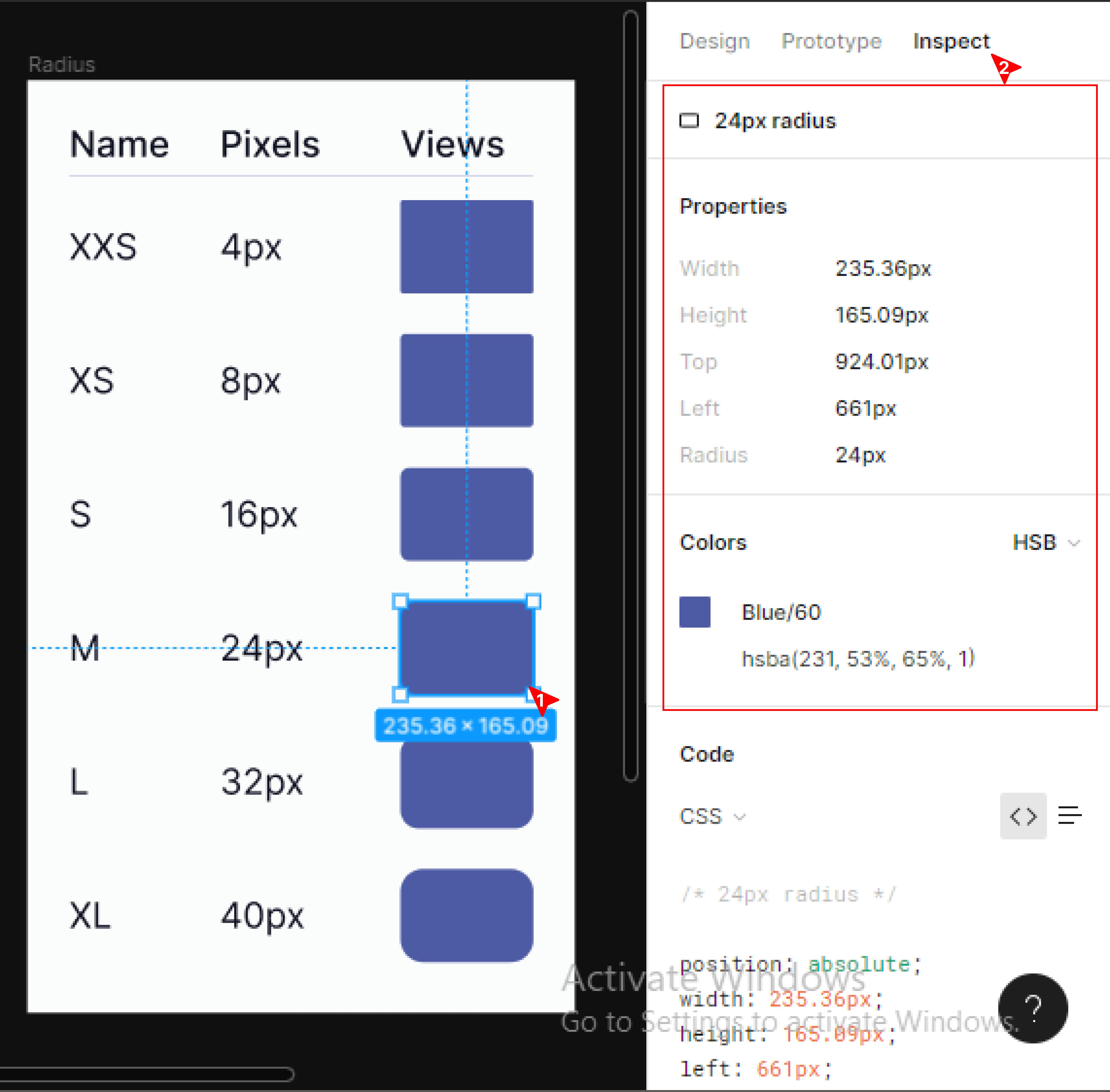
To discover the property or type of border-radius used in an element or component, simply click on any component eg button, card, or input field, and navigate to the inspect panel to view the property of the element. Properties can easily be copied from Figma into your code.
Shadow
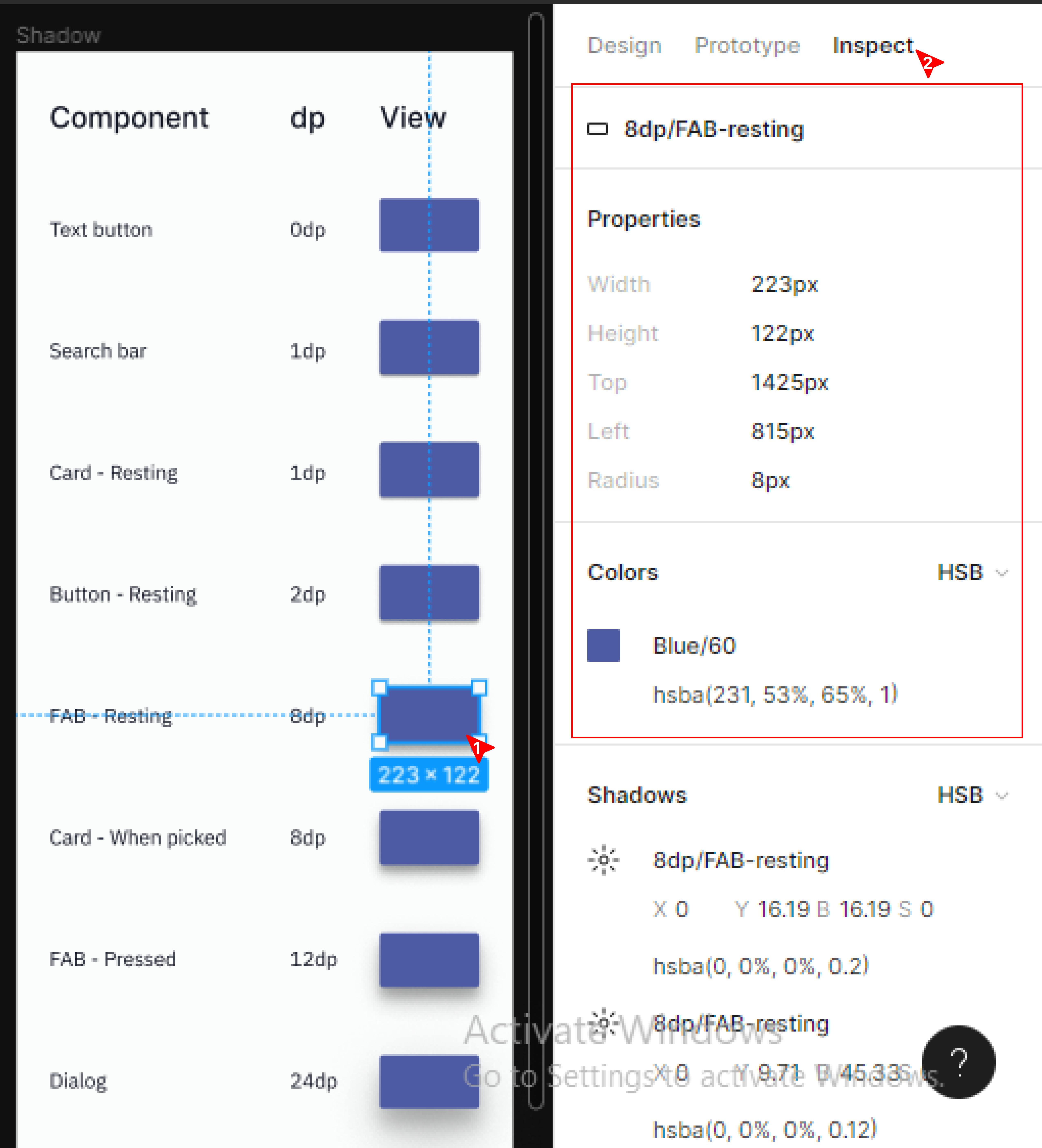
As I previously said to be able to view the properties of an element or component, click on the component and then the inspect tab on the right pane to see all properties including a shadow.
Lastly, on the design tokens, we’d be looking into an important part of a design that stands as a guide to every other decision made as regards a particular content or element or the arrangement of contents on a screen.
Spacing and sizing
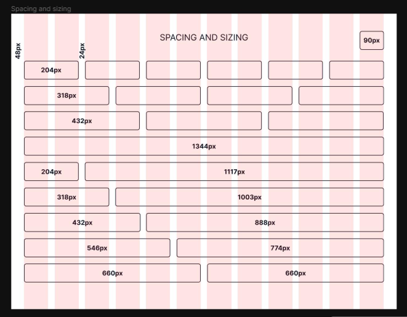
You can’t talk about the sizing or spacing of elements in design without using the grid system. The grid helps arrange elements into columns and rows. Above we are using a 12-column grid to explain spacing and sizing simply because it can be easily divided giving you an evenly spaced 12, 6, 4, 3, 2, and 1 column. As the spacing of a design system should be consistent across the design, the grid helps you to easily identify the number of columns to be used for smaller screen sizes as well.
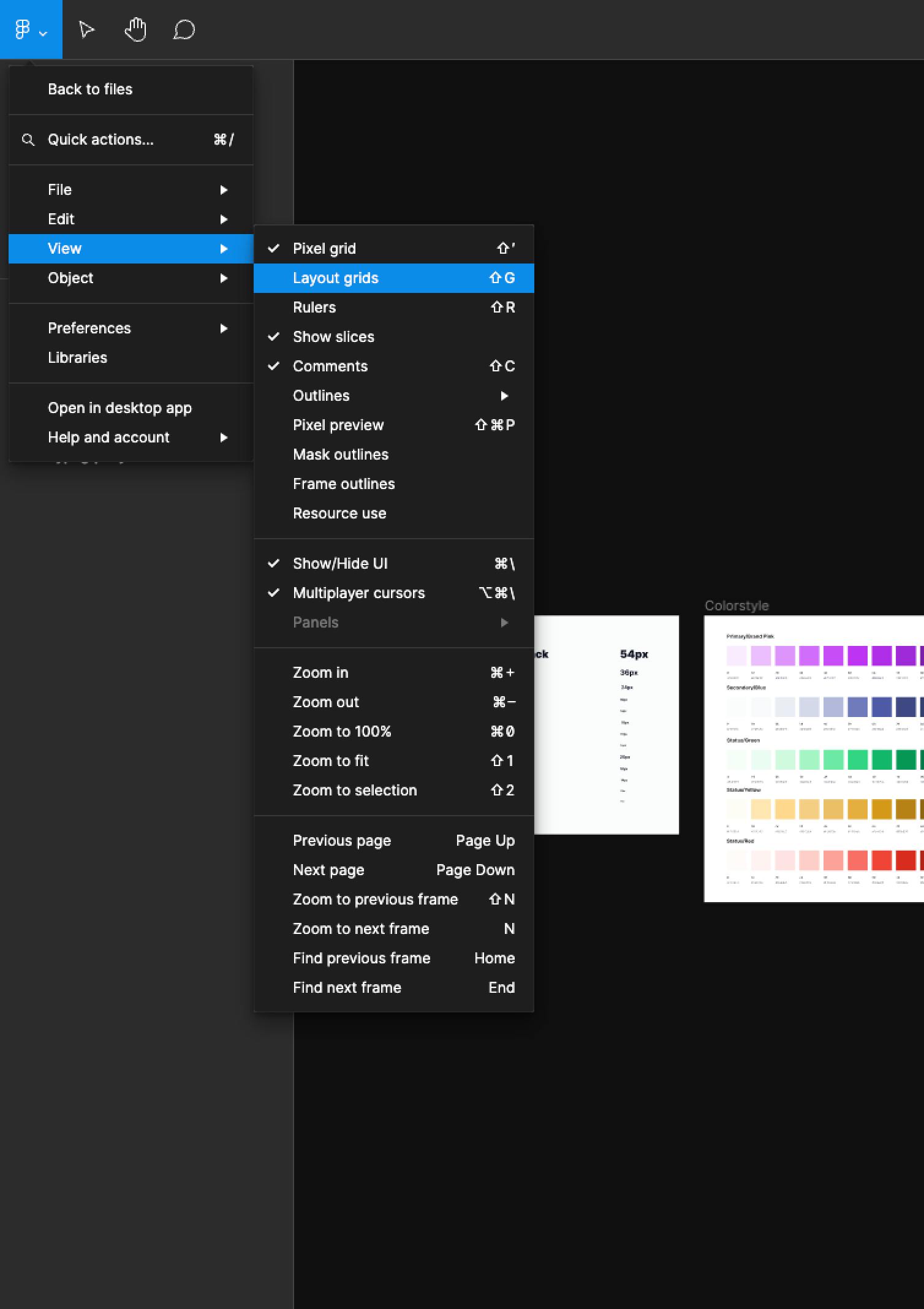
The grid doesn’t show by default on a design. To turn it on, click on the Figma icon at the top-left of the Figma page and click on View and Layout grids inside View.
So how useful is this to a developer? As a web developer, for example, knowing that the max-width of the design is 1440px and the designer used a 12-column grid, once you specify the max width on the page, you can use CSS grid to properly layout contents on the page.
NOTE: There can be more and/or different design tokens than the ones mentioned above depending on the product but an understanding of these will help you work with any design system token.
In the next section, we will look at design components where all of these tokens are used and learn how to work with them.
Design System Components
The elements or contents used in every design are variants of a design component. How can we access all the properties that make up these components? Let’s find out below.
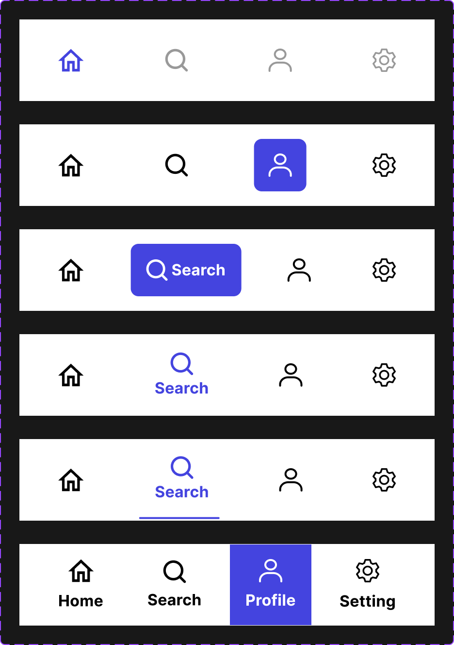
Button
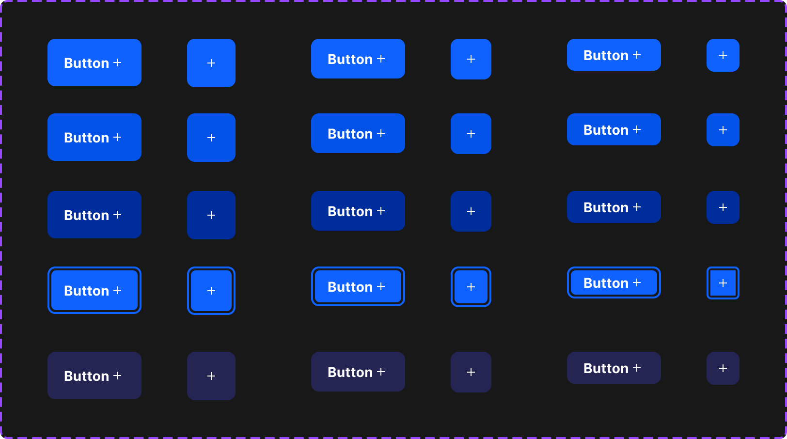
As already known, clicking on an element in the design gives us the property combinations, same thing goes with buttons but due to the fact that most buttons come with a text input and an icon aside from other properties, you'd need to click on the individual text or icon of a button to access its property and use them in your code. So the steps are:
Click on the button to get the styles e.g color, border-radius e.t.c
Click on the text to get the styles
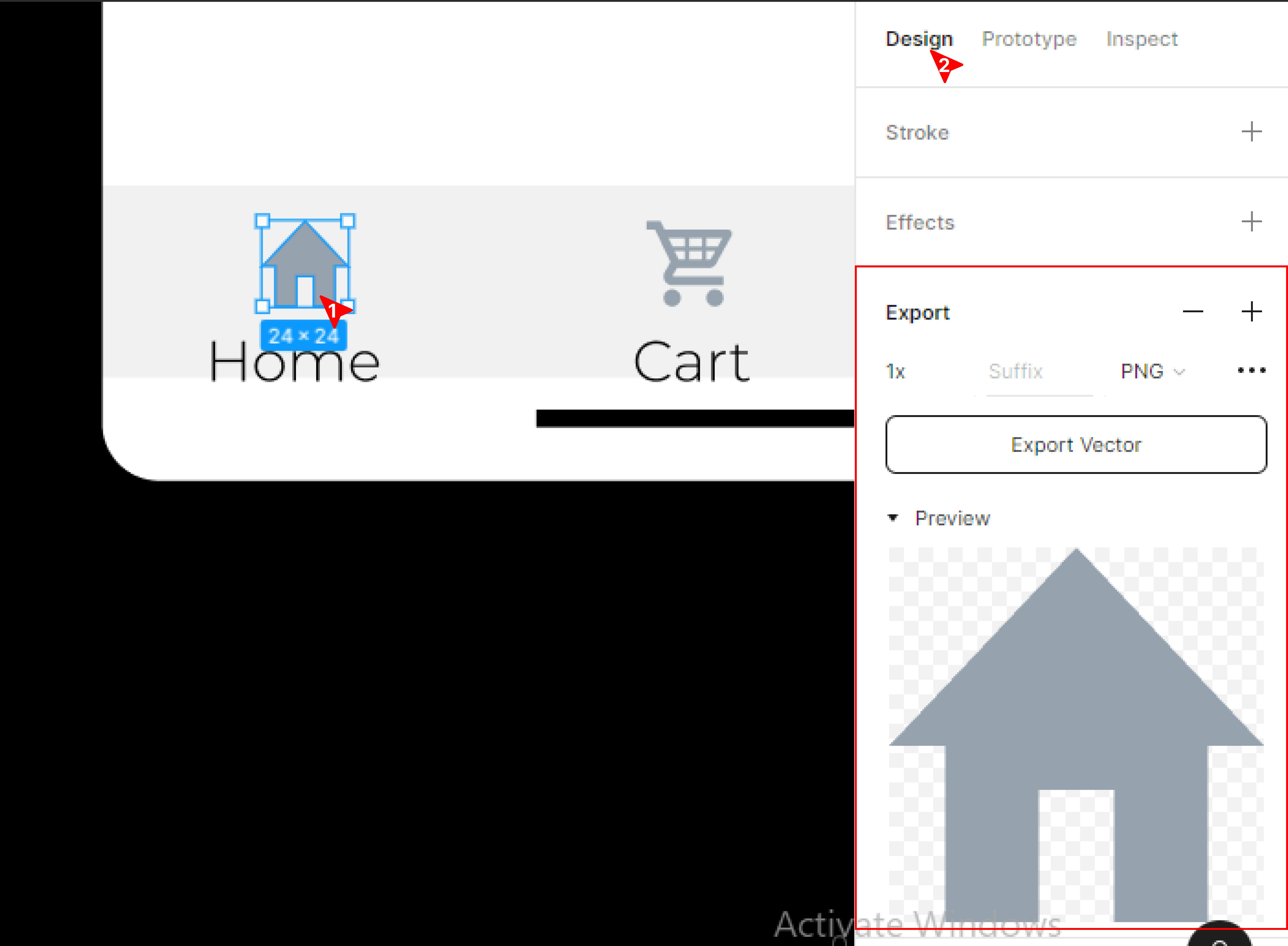
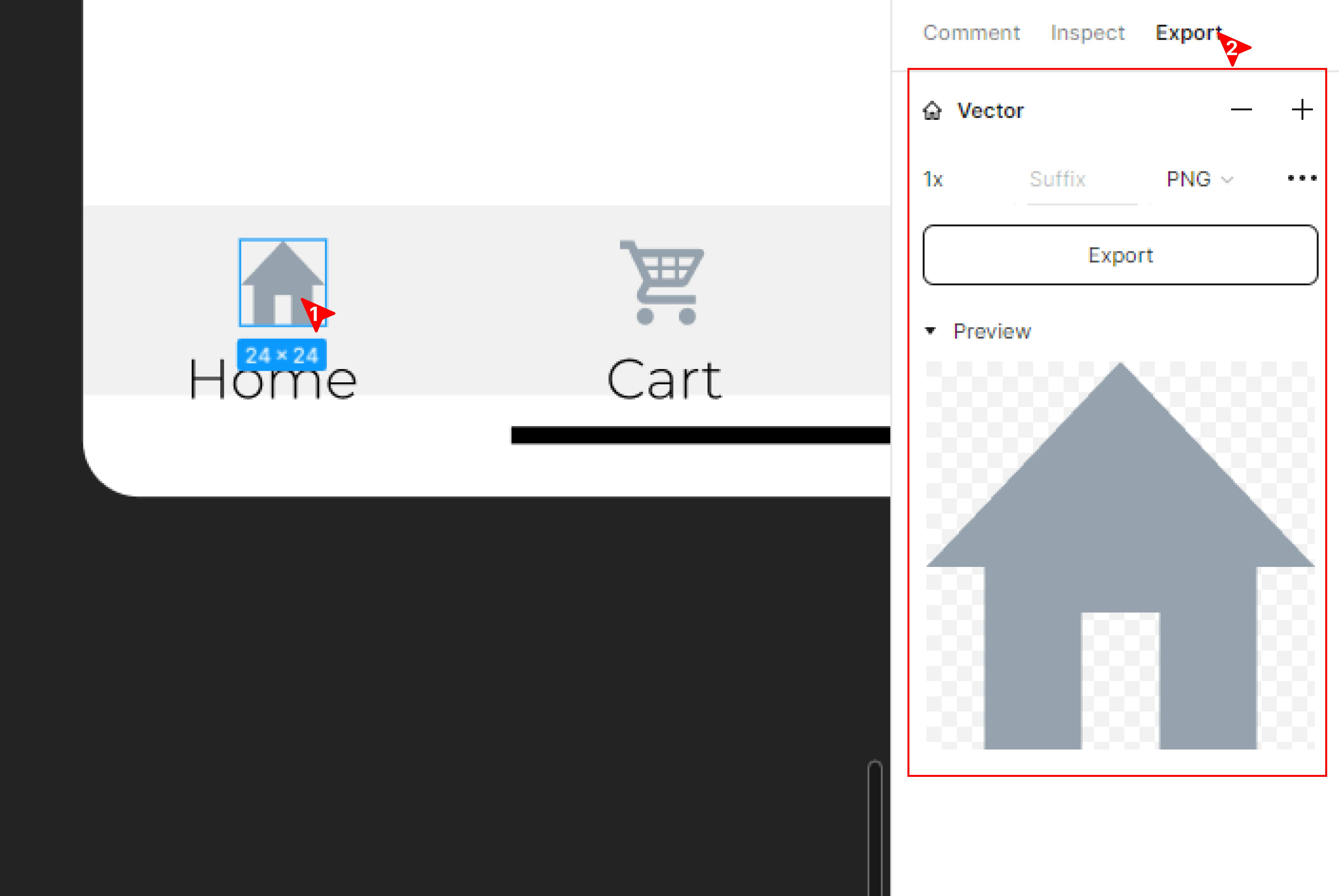
If it has an icon, you have to export it. You can learn how to export an icon from the export asset section below.
One thing to know is that the border radius, font properties and colors e.t.c. that will be used to build a component in a design system are usually going to be from the design system tokens. So it’s possible to build a design system in code that uses those tokens to build components instead of rebuilding components and copying over those properties.
Forms
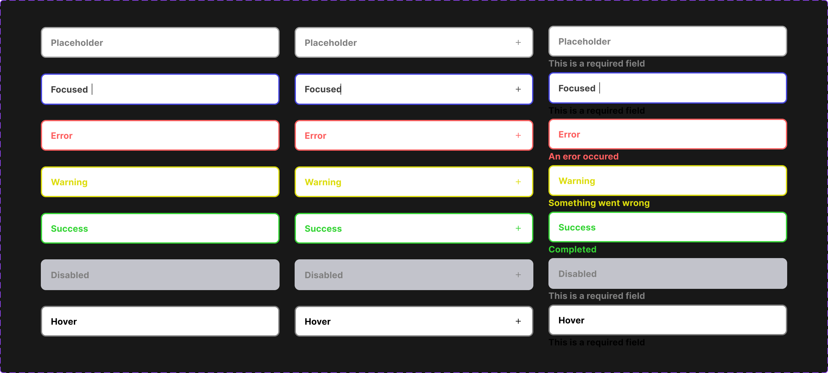
When building form components (such as Input, Select, dropdown e.t.c.) in your coding design system, you have to take note of the different states. Clicking on the form input design shows its properties on the inspect panel including the height, width, border radius, padding, and state of the input. Clicking on each of the form designs allows you to see the different states for which they were designed and their properties.
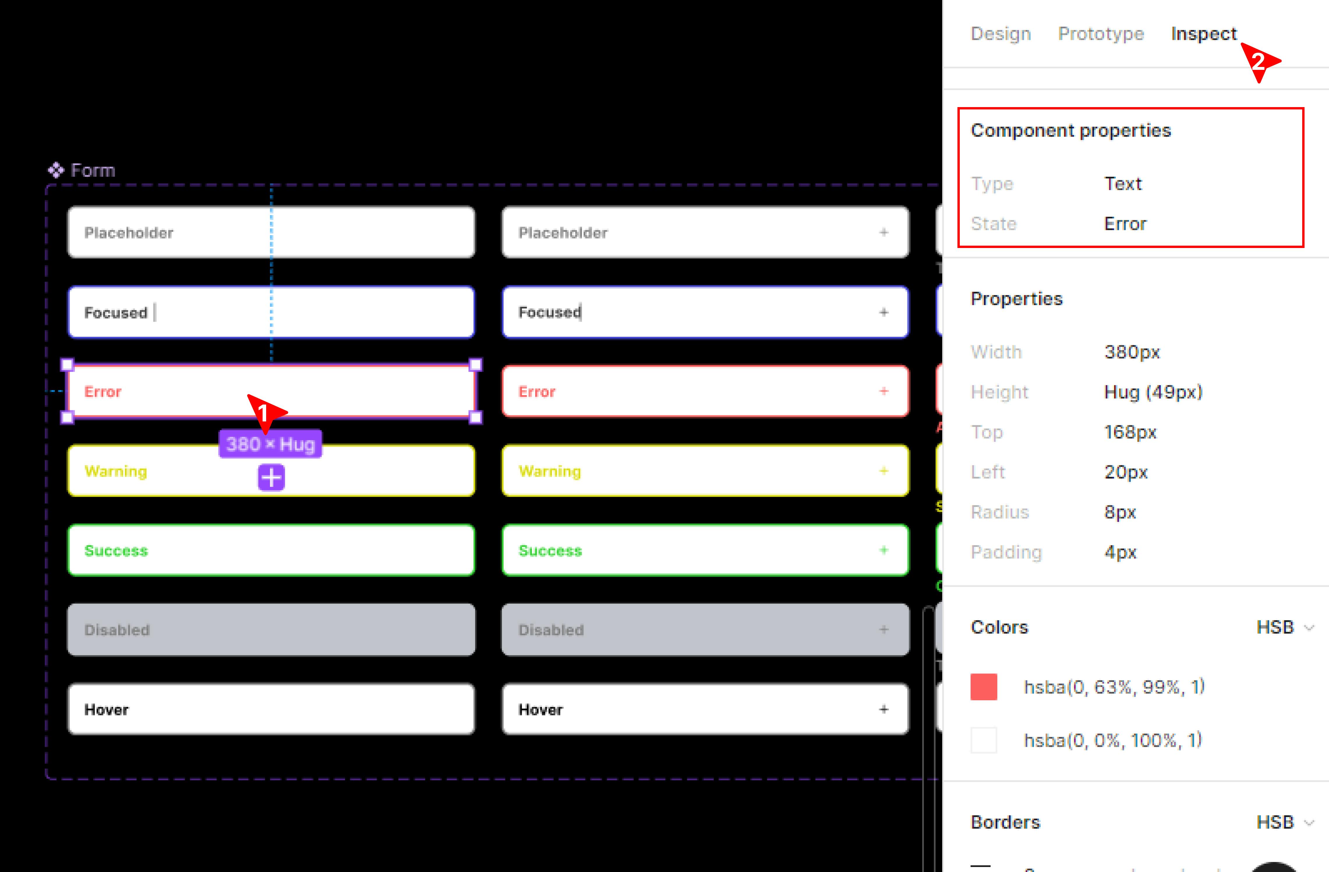
Take note of other things like the text, icon, and label text, their individual properties are rightly displayed just like we discussed for buttons; they can also be accessed.
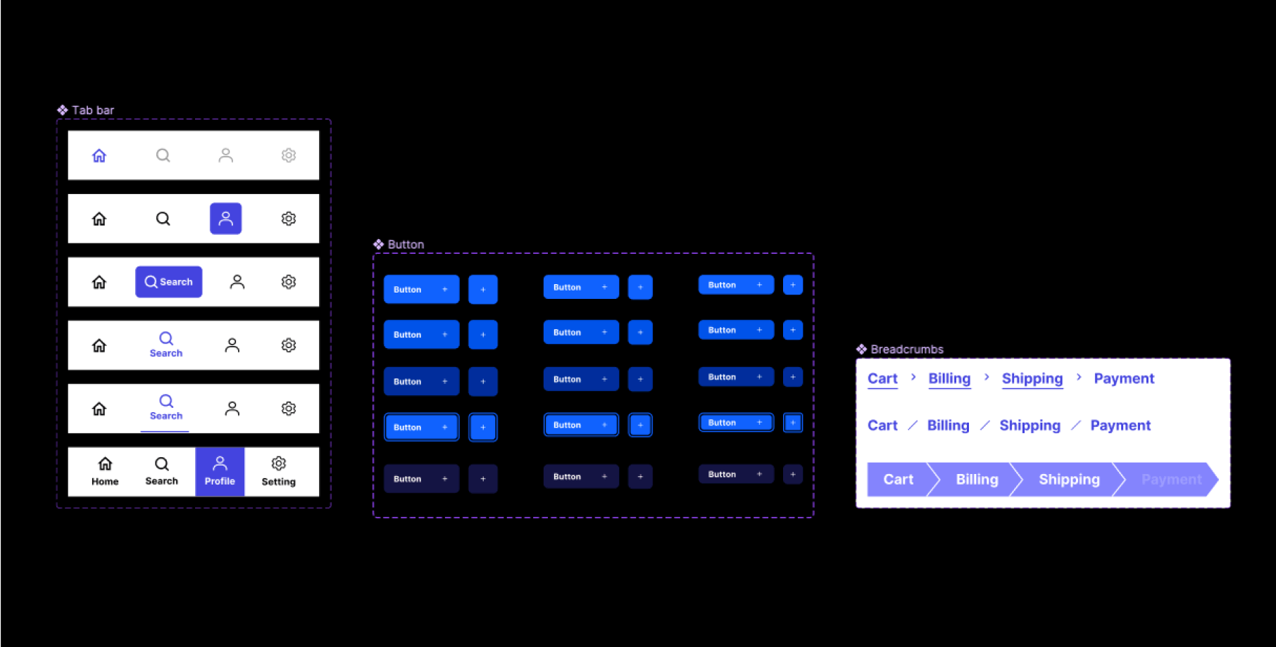
Menus
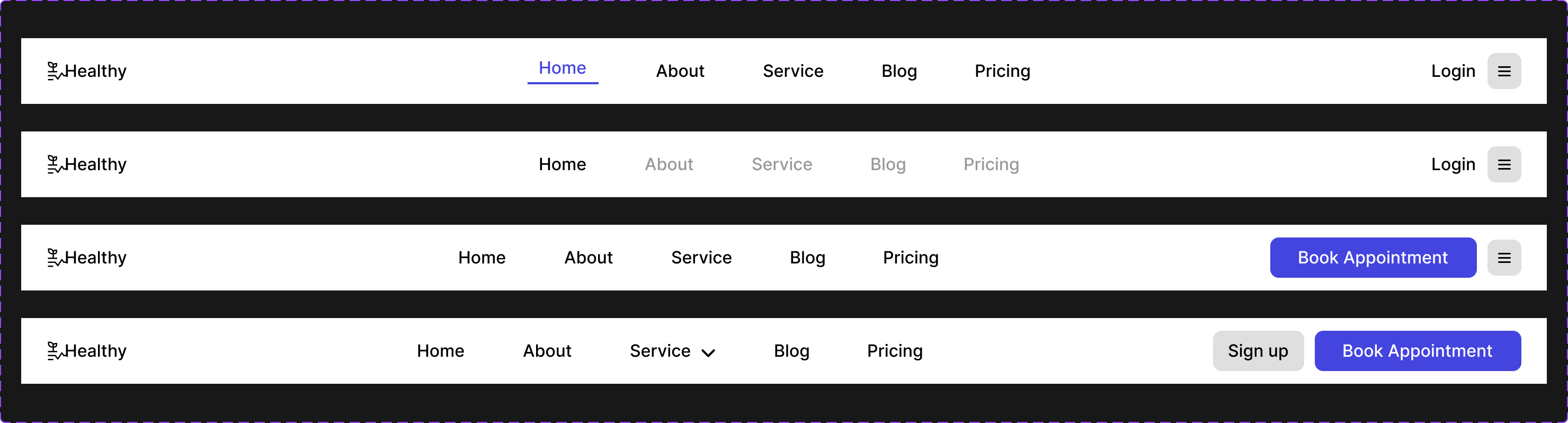
The mobile and desktop designs for menu navigations are different in width, height, and even the content within them. Once you click on a menu design and click on the inspect panel you get to see its full property. Clicking on any content of the design you can as well view their property and export the needed elements e.g. the logo.
Tabs
Bottom tab navigation is found in mobile app designs and as such, you should first consider the screen size. They consist of assets that are exportable and just like other components, clicking on any item shows you the properties (styles).
Just like we discussed above, you can also use the typography design system for texts here as it will be consistent.
Breadcrumbs
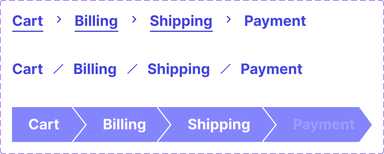
As we already know, clicking on content gives access to its property. So once you click on any text from a breadcrumb component you have all of its properties in the inspect panel.
One thing to note now is that breadcrumbs usually have active and inactive states so your component should include that.
Documentation Page
This is a page that contains valuable instructions pertaining to the designs created and how each style or component should be used.
It is most times found on a different page of the design file or along with the components created as the description above it. It aids in informing the whole team why a certain component state was created and when it should be used to ensure that at every point of the product's design, there is uniformity.
How to export assets from a design system.
To export any asset with edit access to the Figma board, you'd need to click on the asset you want to export (e.g icon), click on Design on the right pane and scroll down to the export option to add that particular asset to be exported, you can always preview the asset to be exported or change the format by which you want the asset to be exported.
The process isn't exactly the same without edit access. To export without edit access, after clicking on the asset to be exported, click on the Export tab on the right pane. You can also preview the asset and change the download format.
Conclusion
In this article, we learned how a design system is used as a front-end/UI developer by diving into what a design system is, why a developer should consider building one, how to use a design system, how to export assets e.t.c, and now you have the skillset required to use a Figma design system as a developer.
Remember that to get a full understanding of how specific variables/tokens/components in the design system are styled or how they should be used, visit the documentation page of the design.
Also, note that it’s good to build your design system before building pages to 10x your development process.
Thank you for reading. Like and leave a comment if you enjoyed reading.