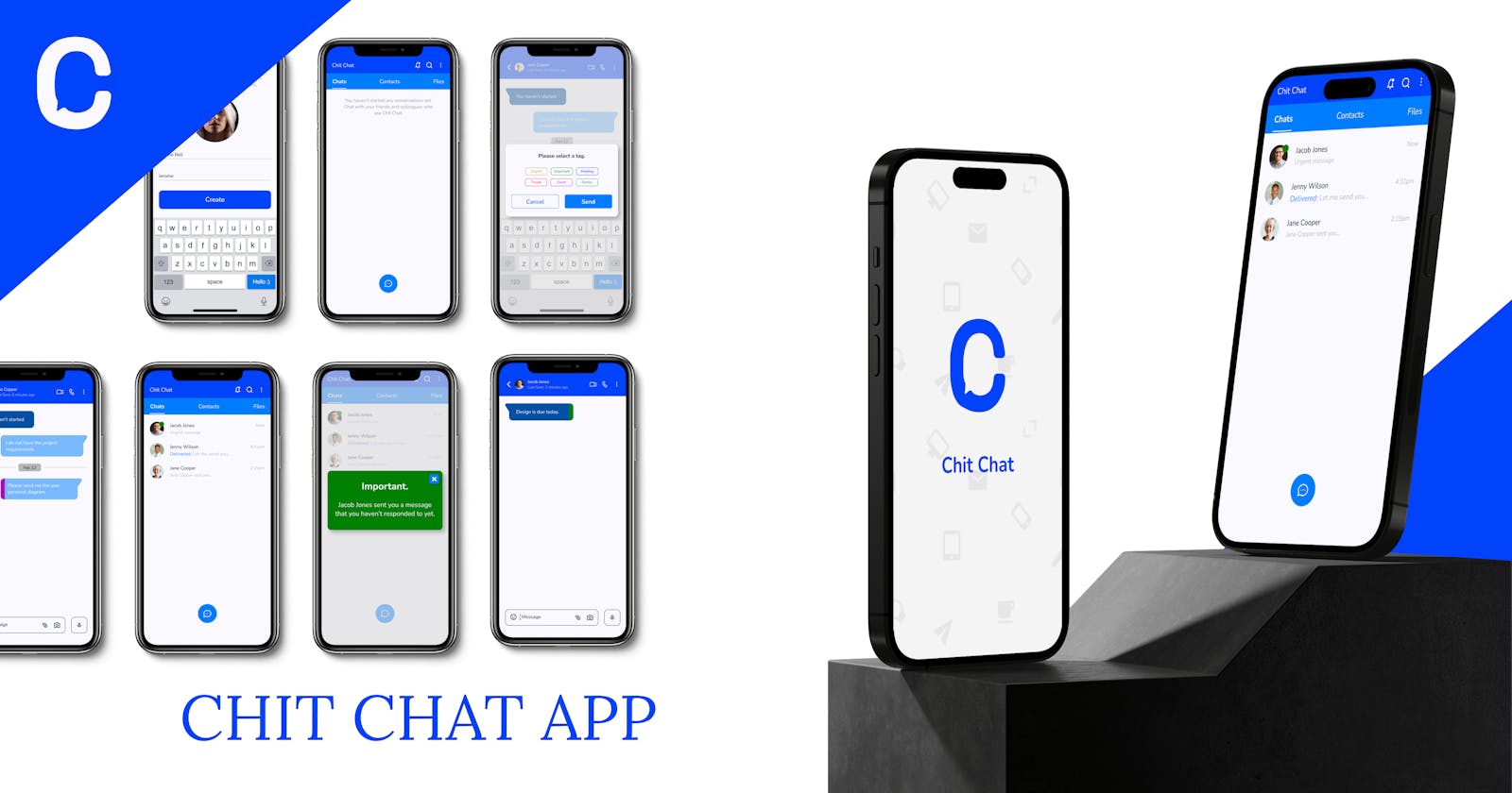
Empathy in Emergencies: A Chat App Design Study on Urgent Notifications.
About Chit Chat
Chit Chat is a cutting-edge social mobile app designed to redefine the way we connect and communicate. With a focus on speed and responsiveness, Chit Chat aims to provide users with an unparalleled experience of swift communication and almost immediate responses to their messages.
In today's fast-paced world, communication is the cornerstone of our relationships and connections. Chit Chat acknowledges this reality and has been meticulously crafted to cater to the need for instant responses and rapid conversations. Whether you're catching up with friends, collaborating on a project, or simply staying in touch, Chit Chat is your go-to platform for staying connected without missing a beat.
The Problem
Not getting a response to important messages as fast as they should come. Nothing is more annoying in a chat conversation than sending a question or message that you need to be responded to immediately. Not knowing when you are sent a message that needs to be attended to urgently is another thing as you sometimes feel bad for not being able to answer the chat on time.
This is the problem with our social apps today.
The Solution
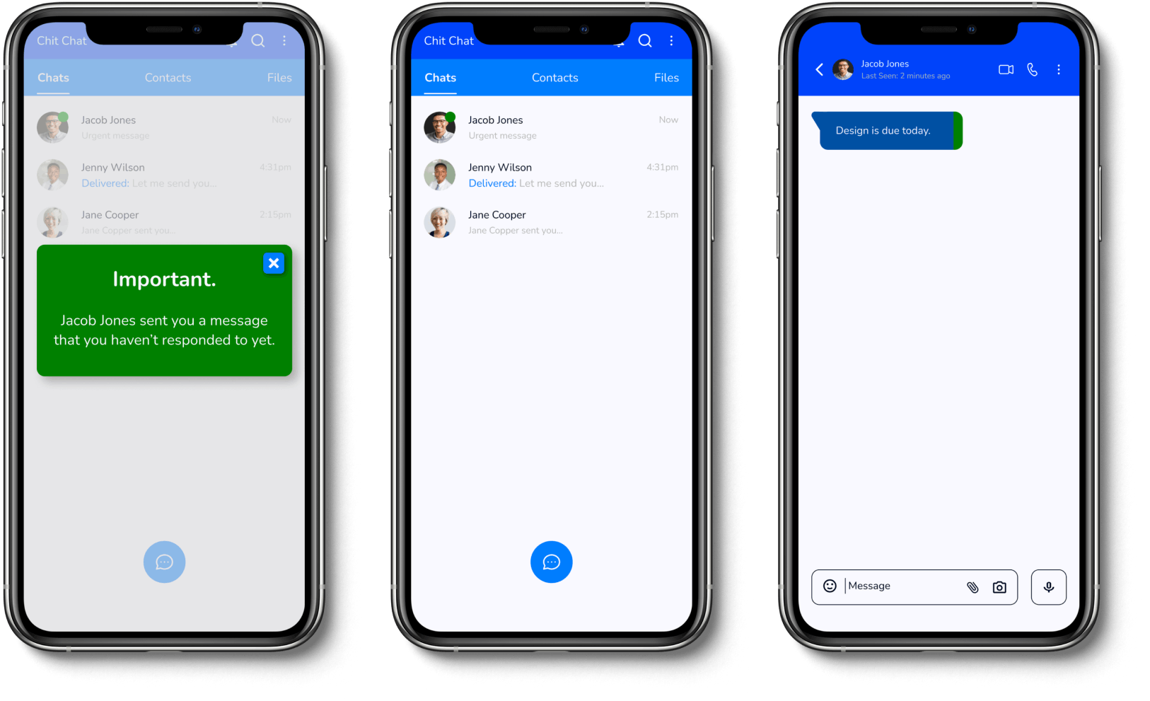
With this design, I was able to fix the problem of delayed response to urgent messages by first allowing users to tag their messages and afterward a pop-up reminder will be displaced a minute after the message is sent and not responded to.
My Role
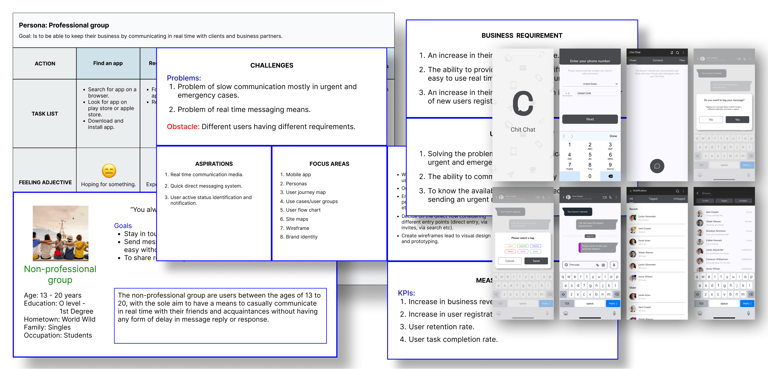
Since this is a personal project, I was the sole designer for this 6-months project, and I
Conducted user/design research to understand the personas, their tasks, and their workflows. To get clearer insights on how the design interface will be presented.
Created wireframes and prototype connections with the help of the research insight gotten, I was able to empathize with the user during this section.
Validated prototypes through user testing, and was able to gather insights on features that needed improvements.
Created high-fidelity mock-ups using the initial wireframes, and went ahead to develop a design system and style guide for the product.
Did a final user-testing validation to ensure that the design has all-around functionality.
My Process
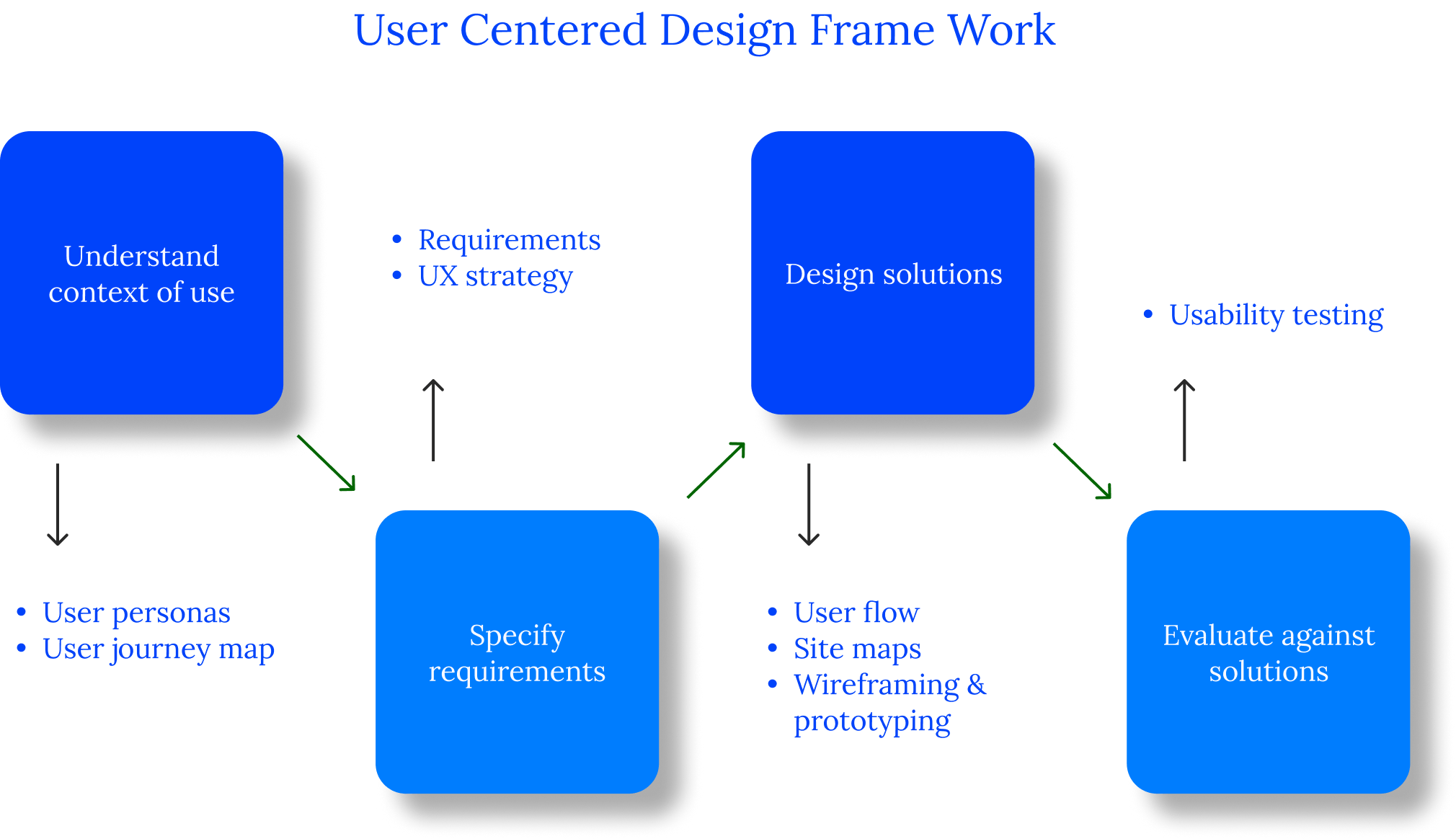
With the help of the user-centered design framework, I was about to create, test, and, build the native mobile app.
Process Highlight
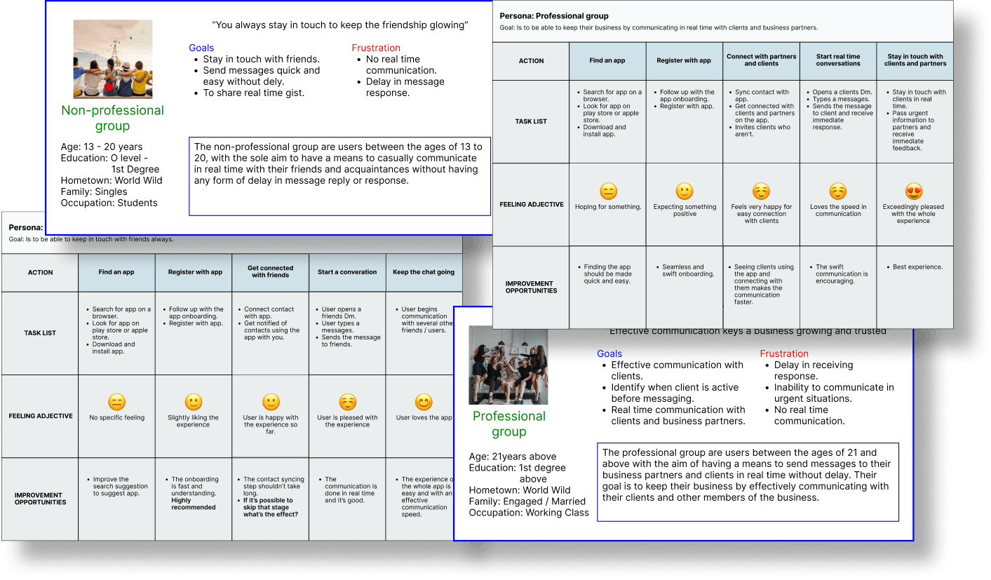
Understanding the context of use. I met one on one with the end user to determine their pain point, workflow, objectives, and what they intend to achieve. This helped me to determine the use cases, creating personas and user journey maps that helped to understand the users better.
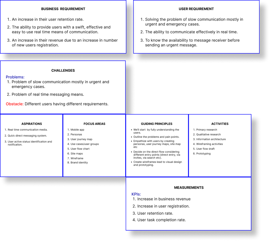
Specifying the requirements. After several meetings with users, I compared their insights with the current challenges experienced by some of our social apps and I was able to come up with the requirements for both users and the business and UX strategy.
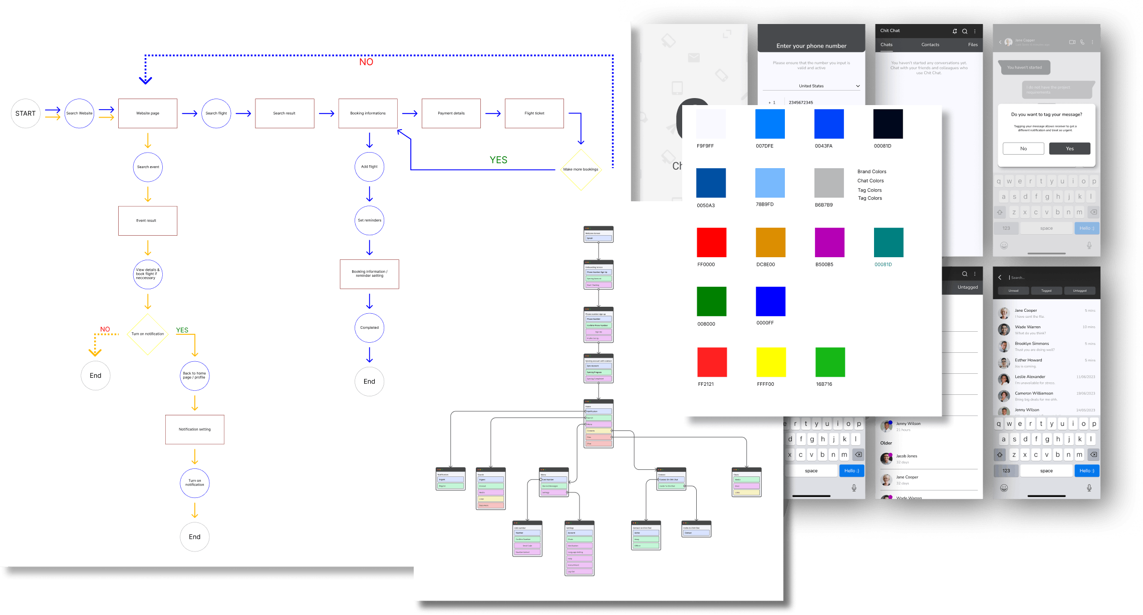
Coming up with design solutions. At this stage, I needed to use the insights gotten from the research, deciding on how the UI will look, and how the flow will be in order to achieve the desired goal. I created a user flow diagram, site map, and product style, and did major wireframing and prototyping.
Evaluating against the requirements. I conducted 2 rounds of user testing to validate these UI improvements, ensuring that it meets both the users and the product's requirements.
Final Thoughts
This project taught me a lot, designing basically for users one has to consider the various ways the product is going to be used. Even after a design is validated as time goes on more changes and areas of improvement will arise.
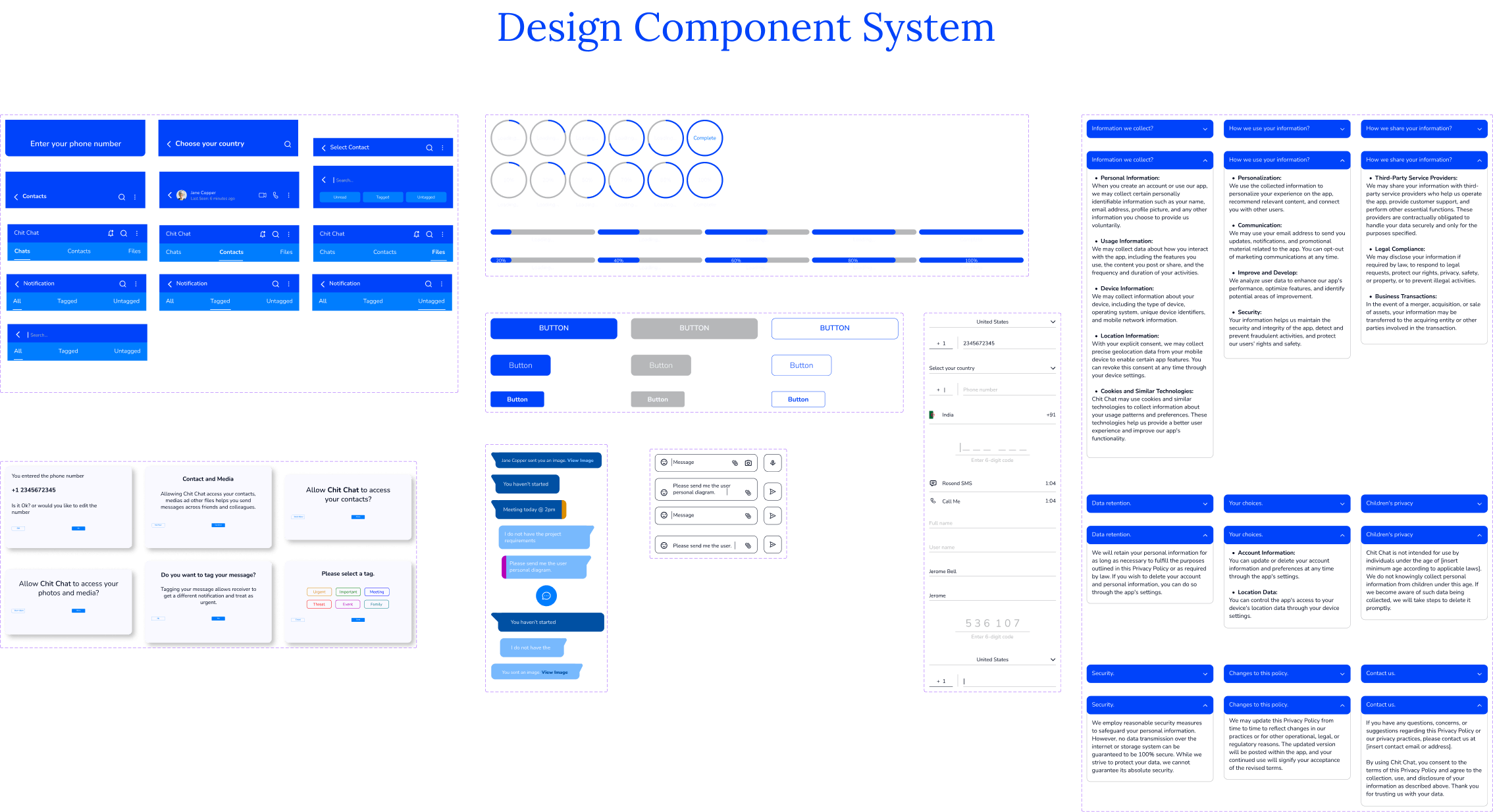
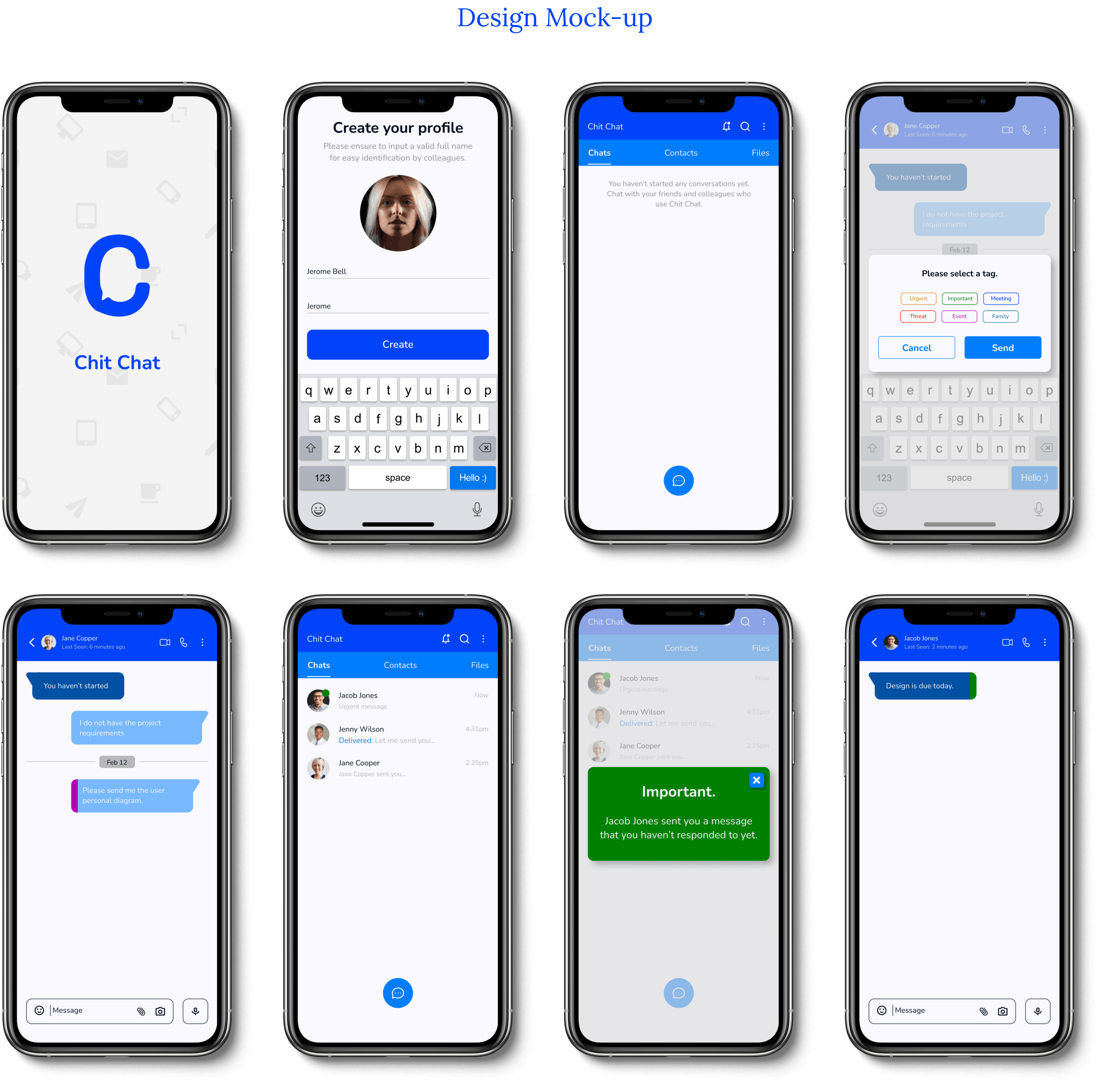
View all UI screens and prototypes HERE
Thank you for reading. Do well to Follow, Like, and leave a comment.
