Unmasking the Secret of Colors - Part 2: Harmonizing Colors, Palettes, and Theory.


In part 1 of this series, we discussed Color Properties, Its Models, and Wheels making it known that by carefully selecting and combining hues, we can create harmonious or contrasting color schemes that evoke specific emotions and convey desired messages.
in this part, we'll look into how we can harmonize colors, some color palettes, and color theory.
Color Harmony
The pattern or ways of combining colors that become visually pleasing to human eyes. One of the major aims of designers or any creative that works with colors is to achieve color harmony as it engages users or viewers and creates a sense of order, bad color usage can result in a boring, messy, or chaotic interface or presentation that drives users away. Is the basic technique for the best color combination.
We can't talk about color harmony without looking into color palettes.
Color Palettes
Is a combination of colors used by designers and creatives when designing. It can form a brand's visual foundation. It is also the full-color range in display on a screen or print. It helps in maintaining consistency across the interface or design giving it a pleasing and aesthetic appearance for the users and viewers.
The Different Color Palettes
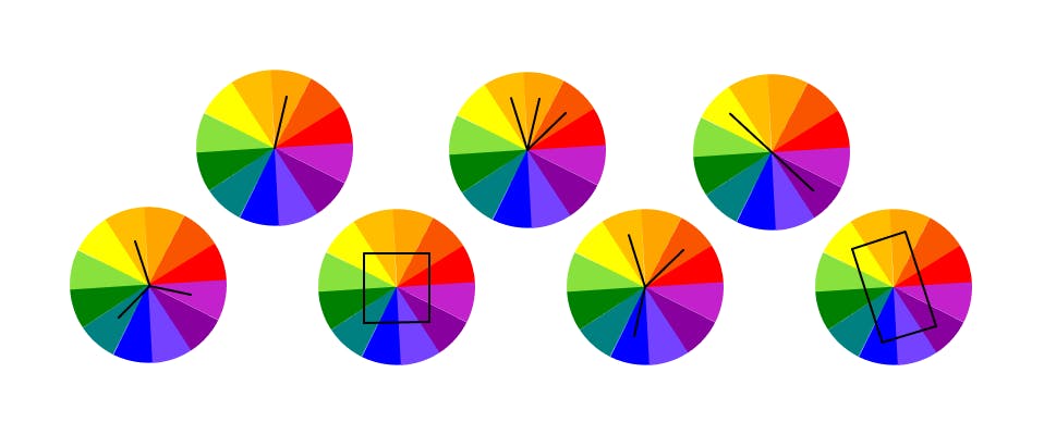
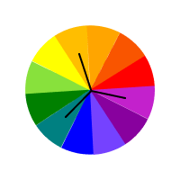
Now that we understand what a color palette is let’s look into the different ways one can combine colors to create an outstanding palette for our next project. The best way to go about this is by first knowing the colors of the wheel and having a clear understanding of how you can manipulate each color property at all times to result in a palette suitable for your design. The color palettes we can use while designing include:
Monochromatic:

As the name implies a single color but different shades, tones, and tints of it. It is easy to create and use across your design.
Analogous:
Using three colors seated together or side by side on the color wheel. The striking difference is always the variation in the color shades.
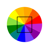
Complementary:
Also known as opposite colors. The use of colors from opposite sides of the wheel provides a high contrast and impact color combination appearing brighter and more prominent.
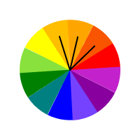
Triadic:
As the name implies the use of three colors that are spaced evenly on the color wheel, involving a larger number of hues opposing each other. This combination leads to a bold and vibrant color.
Tetradic / Square:
The use of four evenly spaced colors on the wheel works well when one color is made dominant but the use of more colors in a palette becomes difficult to handle and harmonize.
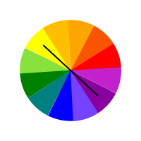
Split complementary:

This is the use of three colors, a dominant color and the other two colors sitting directly adjacent to the dominant color.
Rectangle / Double complementary:
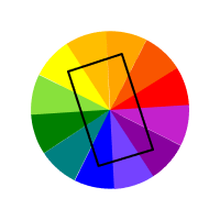
This is the use of two complementary pairs of colors found opposite each other.
Regardless of the color scheme you select bear in mind the preferred palette required in your design, it is good you start with the monochromatic color scheme to enable you to get your hand dirty with the tints and shades. Have in mind that it isn't a must that you use all five colors of your palette, you are at liberty to make the most of using just two or three colors from your palette.
Color Theory
Is a combination of science, psychology, and emotion. It is the guidance for the mixing of colors and visual effects one gets from a specific combination. A set of guiding rules used by designers to communicate with users through pleasing color schemes in visual interfaces. It explains how humans perceive colors and the visual effects they give to the eyes. It guides artists and designers in the making of color palettes leading to effective design communication.
Moving Forward
The use of color is manipulative mostly when you are aiming at giving a perfect blend. The next parts of this series will look at color psychology and how to choose colors:
Part 3 will focus on color psychology, common use in design, and its benefits.
Part 4 will dwell on some considerations when choosing colors for a brand, a color scheme, and when using colors.
Thank you for reading. Do well to Follow, Like, and leave a comment.