Unmasking the Secret of Colors - Part 3: Color Psychology, Common Uses, and Benefits.


In part 1 of this series, we discussed Color Properties, Its Models, and Wheels making it known that by carefully selecting and combining hues, we can create harmonious or contrasting color schemes that evoke specific emotions and convey desired messages.
In part 2 of this series, we discussed harmonizing Colors, color palettes, and color theory. How they help create visually pleasing and balanced compositions. They provide a framework for understanding how colors interact with each other and how they can be combined effectively.
In this part, we'll look into color Psychology, common uses of colors, and the benefits gotten from using the right colors in design.
Color Psychology
It is the study of how colors determine humans' emotions and behavior and the effective use to trigger the right response from consumers. It is said that color has both negative and positive associations and as such we must understand its proper use in the design or creation of content.
Colors can be grouped into three which include:
Warm colors are in general positive, passionate, happy, enthusiastic, and energizing. They include red (primary), orange (secondary), and yellow (primary).
Cool colors are known to be more reserved, relaxed, professional, and calming than warm colors. They include green (secondary), blue (primary), and purple (secondary).
Neutral colors speak volumes while carrying their sophisticated meaning and messages. They include white, black, gray, and brown.
Color psychology gives us a guide to how color positively or negatively affects one’s emotions or behavior and the proper, effective use of these colors in our design or contents to pass the right message.
Basic Colors and Common Design Use
As we previously said, colors have different meanings and are used differently in the world. Let us look into how our basic colors are used in design beginning with the primary colors.
Red
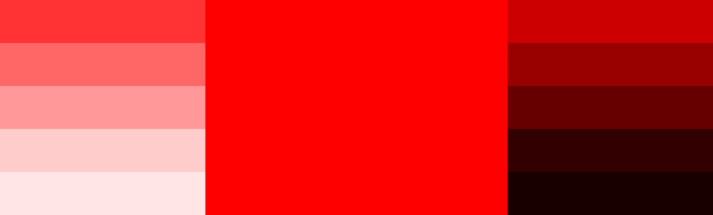
Is a primary color that draws or attracts attention, having a wide range of meanings both negative and positive. In the positive form, it speaks of passion, power, energy, love, desire, and strength, and in the negative form, it speaks of anger, aggression, dominance, and war. When used rightly grabs user attention because of its bold presence. For this reason, should be used wisely in design.
Bright red can be used as an accent color, and whole dark red in combination with gray or white for a professional and elegant look. Red combined with orange stimulates appetite and should be used in fast food, diners, and food apps. Using the right shade of red in design passes either a positive or warning emotional feedback to users.
Yellow
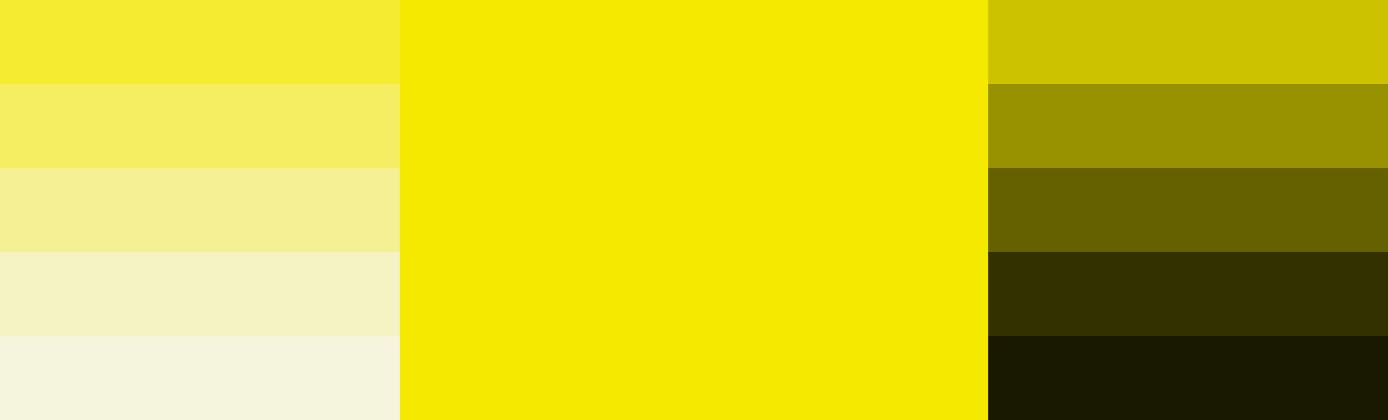
When you see the color yellow I assume the first thing that comes to your mind is the sun and this is because it speaks of joy, friendliness, happiness, and an atmosphere to get inspired and boost confidence. It can also mean illness, caution, and anxiety in a negative form. While designing the use of soft yellow for products and services involving children is recommended, while darker yellow or gold for a feeling of long-lasting appeal or performance.
Blue
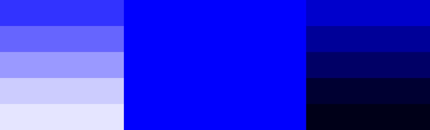
What comes to mind when you see the color blue, I can assume stability, trust, competence, loyalty, confidence, or reliable authority and that is why it is used by most companies. Remember, the sky and the sea are blue thereby used to show the connection with nature in some cases. In design baby blue is used in products related to babies and young children, light blue gives a calming and relaxing effect, and bright blue to get refreshed and energized while for cooperate design where reliability and strength are the aims use dark blue.
Now that we have just concluded how we can use the primary colors let's look into the derivatives of the primary colors (secondary color) and see how we can effectively use them while designing.
Orange
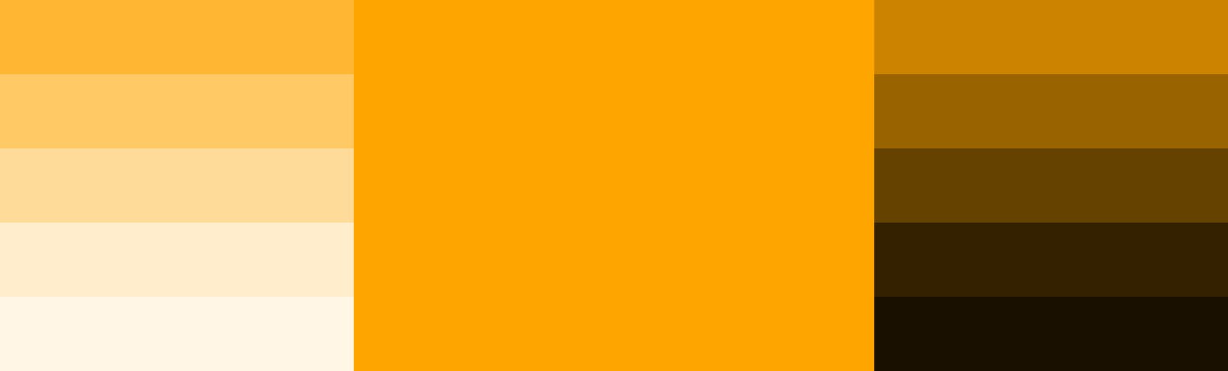
It has the combining power of red and the joyfulness of yellow, therefore, it is associated with optimism and energy, it denotes youthfulness, health, and adventure but has a negative form of rudeness, untrustworthiness, and deceit. In design it is used in food and drink design or websites, it can also be used as a warning depending on the shade in consideration.
Green
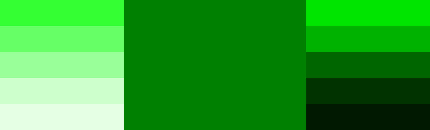
It is strongly associated with nature, renewal, stability, wealth, growth, life, and fertility, and it speaks of balance and harmony while in the negative form, it is associated with envy, possessiveness, and materialism. In design use brighter greens for vibrant and energizing designs, olive greens for the natural world, and darker greens for stability and affluence. Using the right palette passes the right emotional feedback to users, so as a designer one should bear in mind the brand and the audience while creating a color scheme or palette.
Purple
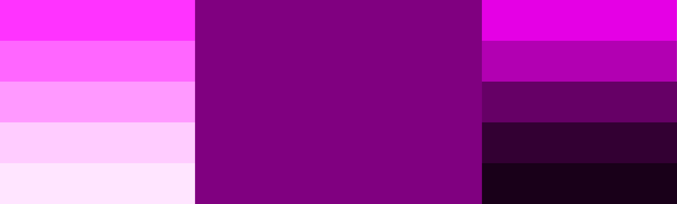
When we talk of purple, we talk of luxury, it is seen as royalty, bringing the feeling of spirituality, sophistication, and creativity, speaking of devotion, pride, independence, magic, and wisdom. In design it makes the brand appear extravagant or introverted, light purple is used for pampering, beauty, and romance while dark purple is for luxury and wealth.
To conclude this section of our article we’ll look into pure neutral colors and how they can be used in the design.
White

You wouldn't need someone else to inform you that white speaks of purity in some areas, clarity, cleanliness, freshness, and simplicity. It has this feeling of a blank slate which means a new beginning but when used too much or excessively in a design it becomes boring and denotes isolation. In design it serves as a background or backdrop and not a color on its own, when used in this manner it helps other colors shine, creating space, balance, and breathing room in your design which builds a solid foundation for readability.
Gray

Found on the cool end of the neutral spectrum, when utilized well in design it brings out elegance and sophistication allowing other colors to stand out. It represents neutrality, balance, authority, and dignity. Due to its absence of color, it has a dull look depending on the shade. Negatively it means depression or loss. In corporate designs, it can be used as backgrounds or typography making it appear classic, serious, and reliable.
Black

It naturally conveys an edgy, mysterious, or elegant feel making it a perfect match with any color and creating contrast. Is used as a background color. It is associated with strength, authority, power, formality, or prestige, symbolizing importance. On the negative side, it connotes dark magic, villainy, war, evil, death, and mourning. In design, it's the default for typography, used in the fashion industry because of its association with elegance and luxury.
Brown
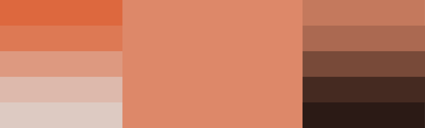
It is usually seen as neutral or natural, evoking the feeling of warmth, protection, security, comfort, earthiness, stability, safety, dependability, and passing emotions related to the natural world. On the negative side, it passes the feeling of loneliness, sadness, and isolation. In design, it is substituted for black in typography or background, it makes brand personality appear serious, reliable, and mature. It can be used to create a natural-looking wood and stone looks in design.
Benefits of using the right colors in design
Color plays an important role in design so one's ability to use the right color while designing already puts your design in a better view for the users. In design it sets the brand tone and emphasizes the brand image, drawing users' attention to what is important while positively affecting their emotions, influencing clarity, and increasing usability and readability. It directs users' eyes throughout the design and lays focus on what is important (important elements like “call-to-action”). Even for the smallest details, color is important, when used well in design it goes beyond the presentation of a clear design, it also puts the brand out there leaving a positive emotional impression for users.
Moving Forward
We will conclude this series in Part 4, by dwelling on some considerations when choosing colors for a brand, a color scheme, and when using colors.
Thank you for reading. Do well to Follow, Like, and leave a comment.