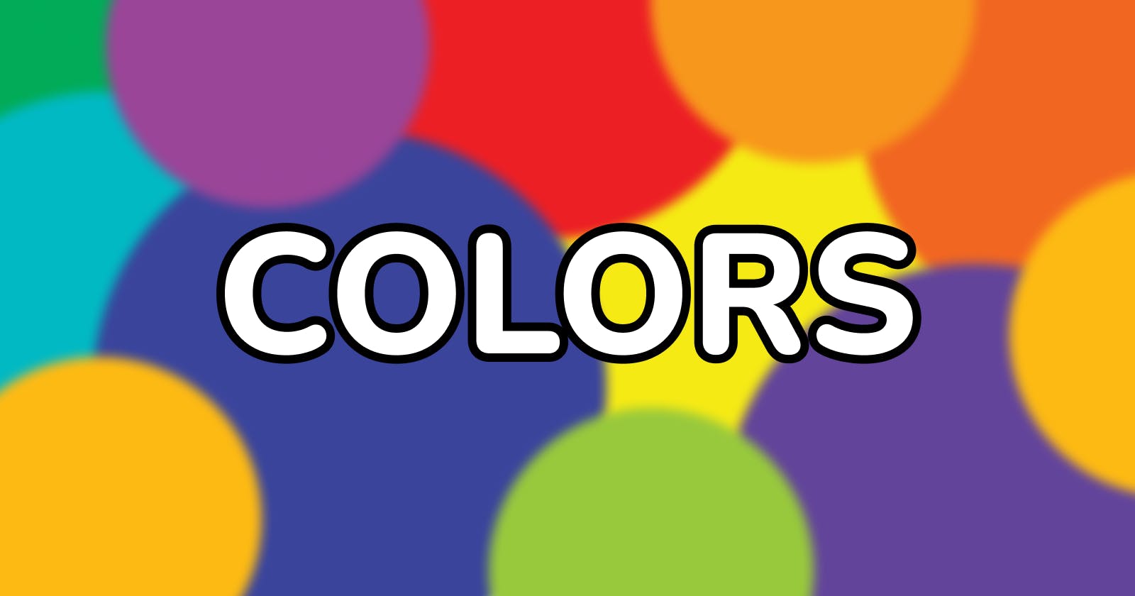
Unmasking the Secret of Colors - Part 4: Choosing Brand Color, Color Scheme, and its Magical Influence.


Previously in this series:
In part 1 of this series, we looked at colors, their types, and the wheel.
In part 2 of this series, we looked at harmonizing colors, its eye-catching palette, and theory.
In part 3 of this series, we looked into color psychology, common use, and benefits.
In this concluding part, we will look into some of the things to consider when choosing the colors to use either for a design or combining to get a color scheme.
Let's get started:
When choosing a color for the design
As a designer when working on a project, you don't randomly select colors to use in the design else you'll end up passing the wrong information, not representing the brand, reaching out to the wrong audience, or leaving the wrong emotion in the heart of users. Here are some basic things to consider when choosing a color:
Target audience: Research your target audience, how they perceive certain colors, the meaning of the colors, and what their cultural or traditional beliefs concerning the colors are. These will help you know the right way to adjust and tone the colors to leave a positive mark on your audience.
Brand identity: What brand are you designing for, and how do they put themselves out there? A food brand will have a different look and feel from a clothing brand as well as a health brand. So study the brand you are designing for and understand how they present themselves.
Competitors: You should know your competitors by now but this time focus more on how they use their colors and the kind of emotions left in the hearts of users. Figure out what they are doing right in terms of color usage and how it aids in the retention of users. Also, identify what they are doing wrong regarding colors and either take note to use it by improving on it or avoid it. Remember you want a product that is ten times better than your competitors.
The design in general: Now it's time to think about your design, what kind of design are you creating? a simple, minimalistic, loud, friendly, or text-based design, will it be passing the right emotional feedback to the target audience as well as representing the brand's identity.
Once you have figured out all of these and you can balance the brand identity with that of the target audience you are on the right platform to proceed with your design.
When choosing the color scheme for the design
Now you've got the right colors for your design, it's time to create your scheme or palette. First, ask yourself how many colors you want on this design or what kind of palette you want to make use of that is suitable for the design. Remember the fact that your palette has five colors doesn't mean you must use all. Let us look into some considerations after selecting your colors.
Shades, tints, and tones.
Always bear in mind the color psychology behind the colors selected and how a light or dark shade will affect your users' emotions and the brand's identity, do you want your colors moving towards the grey end or the light end and how does it affect users' emotions and cultural belief.
Brightness.
It increases the overall lightness of color making it appear calmer and more relaxed to the eyes. What amount of white do you need to be added to your color and how does the choice affect the way the design is perceived by users?
Contrast
It is an aspect that should always be emphasized. A good contrast can bring about a good and pleasing design in the eyes of the users but when not used in the right manner causes noise and chaos to the users. It adjusts the difference between the darkest and brightest colors creating a balance between them.
When considering these when working with your palette the result is always an aesthetically pleasing design that positively affects the users' emotions while passing the brand's message.
Tips for using colors
Well, there are no laid-out tips just people making use of what feels right and works best for them while considering accessibility, readability, clarity, legibility, and responsiveness. Create a color palette containing three to five colors and play around with it but be mindful of using inconsistent colors in a single design as it spoils the look and feel of the design. Use colors wisely to draw attention and always check for color contrast. Bright colors tend to hurt the eyes so they can be replaced with calm colors. Learn to differentiate semantic colors (colors that indicate value state, communicating purpose, and passing messages such as blue, green, yellow, and red). Know how to use color shades and play around with color properties while designing to convey the right information to your audience.
Conclusion
In conclusion, delving into the world of color through the study of color harmony, color palettes, and color theory allows us to unravel the secrets hidden within the vibrant spectrum. By understanding how colors interact, we gain the power to create visually pleasing compositions that evoke emotions, convey messages, and capture attention. Color harmony guides us in selecting combinations that bring unity and balance to our designs, while color palettes serve as invaluable tools for organizing and guiding our color choices. Meanwhile, color theory empowers us to comprehend the profound effects colors have on our perception and psychology. With this knowledge, we can unlock the true potential of color, harness its expressive capabilities, and create captivating works of art that resonate with viewers on a profound level. Unmasking the secret of color allows us to wield its immense power and transform our creative endeavors into masterpieces.
Thank you for reading. Do well to Follow, Like, and leave a comment.